Choosing the right interior paint colors is one of the most powerful decisions you can make in home design. Color influences mood, defines space, enhances lighting, and even impacts how large or small a room feels. In this guide, we’ll explore why interior paint colors matter, how color psychology shapes your living environment, the latest trends this year, and how to select the perfect palette for every room in your home.
You’ll also discover practical tips for balancing neutral and bold tones, understand how lighting dramatically affects paint appearance, and learn about common mistakes to avoid when selecting interior paint colors. Whether you’re refreshing a single room or redesigning your entire home, this expert-backed guide will help you make confident, stylish decisions.
Why interior paint colors matter in home design
Interior paint colors are far more than decorative details — they define the entire atmosphere of a home. Color establishes mood, supports architectural features, and influences how large, warm, bright, or inviting a space feels. A well-chosen palette can make a compact room appear more spacious, highlight natural light, or create a cozy retreat in an otherwise open floor plan. Because walls typically cover the largest surface area in a room, paint color becomes the visual foundation of interior design.
Beyond aesthetics, interior paint colors also impact functionality. For example, lighter shades can increase perceived brightness in darker spaces, while deeper tones can create focus and intimacy in large rooms. Designers often use color strategically to guide the eye, create balance, and visually connect different areas of a home. When used intentionally, paint color helps unify furniture, décor, flooring, and architectural elements into a cohesive design story.
From a property value perspective, interior paint colors can significantly influence buyer perception. Neutral, modern palettes often make homes feel move-in ready and well maintained, while outdated or overly personalized colors may limit appeal. Whether you are designing for personal comfort or resale value, thoughtful color selection plays a critical role in the overall success of your interior design.
Understanding color psychology for interior spaces
Color psychology plays a central role in choosing interior paint colors because different shades naturally evoke specific emotions and behavioral responses. Designers and psychologists agree that color can influence mood, energy levels, and even perceived temperature within a room. This is why bedrooms often feature calming hues, while kitchens and social spaces tend to use warmer, more stimulating tones.
Cool colors such as blues and soft greens are commonly associated with calmness, relaxation, and clarity. These tones work particularly well in bedrooms, bathrooms, and home offices where tranquility and focus are priorities. Warmer colors like terracotta, muted reds, and golden neutrals create a welcoming and energetic atmosphere, making them ideal for living rooms and dining areas where conversation and connection take place.
Darker shades, including navy, charcoal, and deep forest green, can add sophistication and intimacy when used intentionally. However, they require balanced lighting to avoid making a room feel enclosed. On the other hand, light neutral tones—such as beige, greige, and warm whites — offer versatility and psychological comfort, creating a sense of openness and stability. Understanding how different interior paint colors influence emotional response allows homeowners to design spaces that not only look beautiful but also feel aligned with their lifestyle needs.
How much does interior painting cost?
Trending interior paint colors this year
Interior paint colors continue to evolve each year, reflecting broader lifestyle shifts and design preferences. Recently, there has been a strong movement toward warm, nature-inspired tones that create comfort and connection. Instead of cool gray-dominated palettes, homeowners are now embracing warmer neutrals like beige, greige, creamy whites, and soft taupe. These shades provide a timeless foundation while adding subtle depth and warmth.
Earthy greens are also trending heavily. Muted sage, olive, and eucalyptus tones bring a calming, organic feel to interiors. These colors work beautifully in living rooms, bedrooms, and even kitchens, especially when paired with natural materials like wood, stone, and linen. Deep blues — particularly navy and midnight blue — remain popular for accent walls and dining rooms, adding sophistication and contrast without overwhelming the space.
Soft blush, dusty rose, and muted terracotta shades are emerging as modern alternatives to traditional neutrals. These tones add personality while maintaining elegance, making them ideal for feature walls or cozy bedrooms. Overall, trending interior paint colors reflect a desire for warmth, comfort, and understated luxury — favoring shades that feel inviting, grounded, and versatile for long-term design appeal.
How much does interior painting cost?
How to choose interior paint colors for each room
Choosing interior paint colors becomes much easier when you approach your home room by room. Each space serves a different function, receives different levels of natural light, and supports different activities. Instead of selecting one color you love and applying it everywhere, consider how you want each room to feel and how it connects to the rest of your home.
Start by identifying the room’s purpose. Is it a relaxing retreat, a social gathering space, or a functional work area? Next, evaluate lighting conditions — both natural and artificial — since color appearance can change dramatically throughout the day. Finally, consider how adjacent rooms interact visually. A cohesive palette doesn’t mean every room must match, but there should be a sense of flow from one space to another.
How long does it take for interior paint to dry?
Living room paint color ideas
The living room is typically the most social space in a home, so interior paint colors here should feel welcoming and balanced. Warm neutrals such as beige, soft greige, and creamy whites create a versatile backdrop that works with various furniture styles. These shades also make it easier to update décor without repainting.
If you want more personality, consider a muted sage green, soft blue-gray, or even a deep navy accent wall. Accent walls can add depth and visual interest without overwhelming the space. For open-concept homes, ensure the living room color transitions smoothly into adjacent areas like dining rooms or kitchens.
Bedroom paint colors for relaxation
Bedrooms benefit from calming interior paint colors that promote rest and relaxation. Soft blues, muted greens, lavender-gray tones, and warm neutrals are excellent choices. These colors help lower visual stimulation and create a peaceful environment.
Avoid overly bright or highly saturated shades, which can feel energizing rather than restful. If you prefer darker tones, consider deep charcoal, navy, or forest green, but balance them with lighter bedding and décor to prevent the room from feeling heavy.
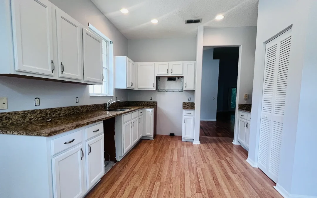
Kitchen and dining room color inspiration
Kitchens and dining rooms are active, social areas where color can add warmth and character. Soft whites and warm neutrals remain popular for kitchens, especially when paired with natural wood cabinetry or stone countertops. However, bolder choices — such as sage green cabinetsor deep blue islands—are increasingly common in modern interiors.
Dining rooms can handle richer, more dramatic interior paint colors. Warm terracotta, muted burgundy, or deep teal can create an intimate and inviting atmosphere for gatherings. Since these spaces are often used in the evening, consider how artificial lighting will enhance the color’s warmth and depth.
Neutral vs bold interior paint colors
One of the biggest decisions homeowners face when selecting interior paint colors is whether to choose a neutral palette or embrace bold, statement-making shades. Both approaches have distinct advantages, and the right choice depends on your design goals, lighting conditions, and long-term plans for the space.
Neutral interior paint colors — such as beige, greige, warm white, taupe, and soft gray — offer flexibility and timeless appeal. They create a calm backdrop that allows furniture, artwork, and décor to stand out. Neutrals are especially beneficial if you enjoy updating accessories seasonally or plan to sell your home in the future, as they appeal to a broader range of buyers. Additionally, neutral tones help smaller spaces feel open and cohesive.
Bold interior paint colors, on the other hand, add personality and dramatic impact. Deep greens, navy blues, charcoal grays, terracotta, and even rich plum tones can transform a simple room into a design statement. Bold colors work particularly well as accent walls, in powder rooms, dining rooms, or offices where you want to create mood and depth. However, they require careful consideration of lighting and room size to prevent overwhelming the space.
A balanced approach is often the most successful strategy. Many designers recommend using neutral base tones throughout the home and incorporating bold colors strategically for contrast and visual interest. This creates harmony while still allowing individual rooms to express character.
Schedule your interior painting consultation today
Ready for a fresh look in your home or office? Contact Multicolor Paint today to schedule a free consultation. Our professional house interior and exterior painting services in Saint Augustine are clean, fast, and hassle-free.
Let our experienced team handle the hard work while you enjoy a smooth, damage-free finish.
Visit us at https://localpainterflorida.com to learn more or book your appointment.
Call me for your estimate: 1(904) 217-9681 – Peter Hando professional painter in Saint Augustine
I perform a quick on-site survey with my team and give you a personalized quote.