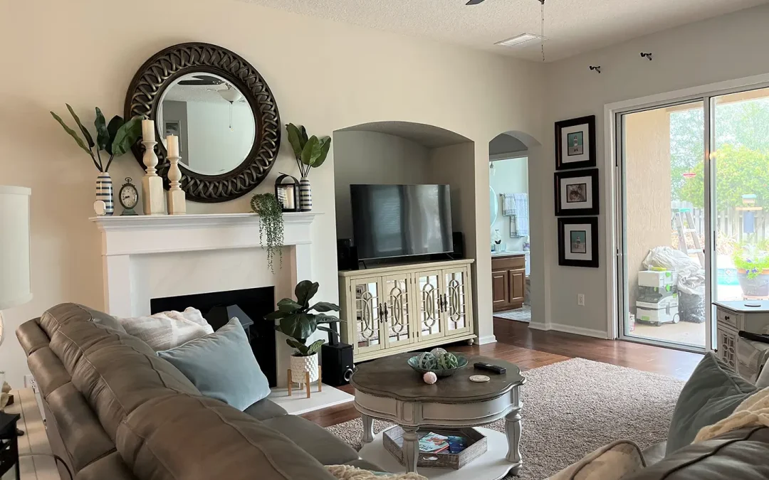
The living room is often the heart of the home—a place where family gathers, guests relax, and everyday life unfolds. Because it serves so many purposes, the way you paint and style its walls can have a major effect on the room’s mood, comfort, and visual appeal.
When exploring fresh ideas for wall painting for living room spaces, it helps to look at both design inspiration and practical guidance. Whether you are planning a subtle refresh or a bold makeover, professional insight into living room painting can help you choose colors, finishes, and techniques that truly elevate the space.
A well-painted living room does more than make a good first impression. It sets the tone for daily life, supports the room’s function, and helps every other design element feel more intentional. From quiet, timeless neutrals to more expressive statement shades, the right paint strategy can completely reshape the character of your home without requiring a full redesign.
Why wall paint matters in a living room
Paint does much more than add color. It shapes how large or cozy a room feels, influences the amount of light the room reflects, and helps define your overall interior style. A carefully selected paint palette can make a compact living room feel more open, while deeper, richer tones can add warmth and sophistication to larger spaces.
The right paint choice also ties together furniture, flooring, textiles, and décor. Even if your furniture stays the same, a new wall color can completely transform the atmosphere and make the room feel updated without a full renovation. This is one of the reasons homeowners and designers alike often start with the walls when they want to refresh a space on a realistic budget.
Color can also affect emotion in subtle but meaningful ways. Soft hues tend to encourage relaxation, while bold tones can energize the room and create a stronger visual identity. In a living room, where comfort and style need to work together, paint becomes one of the most powerful design tools available.
Best color directions for a stunning space
Soft white, warm beige, greige, and light taupe remain some of the most versatile choices for living rooms. These shades create a clean backdrop that works with nearly any style, from modern farmhouse to classic transitional interiors. They are especially useful if you want flexibility in your décor over time.
Neutral walls also allow statement furniture, rugs, and artwork to stand out more clearly. If your goal is a calm and welcoming environment, this approach is often the safest and most elegant choice. It is also a smart option if you expect to update your accessories seasonally, since neutral walls can adapt to many different palettes and textures.
In addition, lighter neutrals often help maximize natural light. In living rooms with smaller windows or shaded exposures, these tones can prevent the space from feeling closed in. They are especially effective when paired with layered lighting, soft textiles, and a few darker accents for contrast.
Earthy tones for warmth and depth
Earth-inspired shades such as olive green, clay, terracotta, muted sand, and dusty brown have become increasingly popular in residential interiors. These tones create a grounded, relaxed feeling and work beautifully in homes that feature natural textures like wood, linen, leather, or stone.
For homeowners seeking cozy yet sophisticated painting for living room updates, earthy shades can bring personality without feeling overwhelming. They tend to feel more distinctive than basic neutrals while still maintaining a sense of comfort and balance.
Earthy tones are also highly adaptable across styles. In a rustic or organic-modern interior, they reinforce natural warmth. In a more contemporary room, they can soften sharp lines and make the space feel more welcoming. When used thoughtfully, these colors add depth without making the room feel too dark or heavy.
Moody colors for drama
If you want a more striking space, consider deeper colors such as charcoal, navy blue, forest green, or deep plum. These shades can add instant drama and luxury, especially when paired with layered lighting, metallic accents, and plush fabrics.
Moody paint colors tend to work best in living rooms with strong natural light or in spaces where you want an intimate, cocoon-like atmosphere in the evening. Rather than making the room feel smaller, they can create a sense of richness and intentional design.
To make dark shades work well, balance them with lighter furnishings, reflective surfaces, and enough texture. A velvet sofa, brass lamp, light-toned area rug, or oversized mirror can keep the room from feeling flat. When done well, darker walls often make art, molding, and architectural details stand out even more beautifully.
Pastels and muted color washes
Muted blush, powder blue, sage, or soft lavender can bring a gentle sense of personality to the living room without overpowering it. These shades are ideal for interiors that aim to feel airy, creative, and slightly playful.
Pastel-inspired wall colors work especially well in smaller homes, apartments, and living rooms that benefit from a fresh and open visual effect. They can also pair nicely with Scandinavian, coastal, or vintage-inspired design styles.
To avoid a look that feels overly sweet or decorative, pair these shades with grounded materials such as oak wood, black metal, woven textures, or simple linen fabrics. This balance keeps the room sophisticated while still allowing the wall color to feel expressive.
Popular wall painting styles for living rooms
Full-room single color
Painting all four walls in one carefully chosen shade is the most classic option. It creates visual harmony and makes styling easier, especially if you prefer a polished and cohesive result.
This approach works well in both small and large rooms, but the exact shade matters. Lighter tones can visually expand the room, while darker tones can make it feel more intimate. A single-color treatment is particularly useful when the room already includes several decorative elements and you want the overall look to feel calm rather than busy.
This method also simplifies the decision-making process. Instead of coordinating multiple paint tones, you can focus on selecting the right undertone and finish. That often leads to a more refined final result.
Accent wall design
An accent wall remains one of the most effective ways to add interest without committing to an entire room of bold color. The best accent walls are typically behind the sofa, fireplace, or TV unit, where they naturally draw the eye.
If you want to feature a large painting for living room décor, an accent wall can serve as the perfect backdrop. Choosing a complementary wall color can help artwork feel more intentional and prominent. This approach can also define a focal zone within an open-plan home.
Accent walls do not always have to rely on dark paint. You can also use a muted contrast tone, a decorative finish, or even a subtle tonal shift that adds depth without creating harsh separation. The key is to make the feature feel connected to the room rather than random.
Two-tone walls
Two-tone wall treatments are gaining popularity for living rooms that need architectural interest. For example, a lower portion painted in a deeper shade and the upper area in a lighter tone can create a balanced, designer-inspired effect.
This style works particularly well in spaces with high ceilings or decorative molding. It can also help visually anchor a room and make it feel more structured. In family homes, two-tone walls can also be practical, since the darker lower section may better conceal scuffs or everyday wear.
Color-blocking techniques can be modern and playful, while more traditional split-wall treatments can feel elegant and classic. The final look depends on the exact shades, line placement, and surrounding décor.
Textured and decorative finishes
Faux limewash, brushed finishes, subtle plaster effects, or textured paint applications can add a custom look to a living room. These styles are especially appealing for homeowners who want more depth and artistry than flat color alone can provide.
Decorative finishes are ideal when you want your walls to become part of the room’s visual story rather than just a background element. They can create movement, softness, and a more handcrafted appearance that standard paint often cannot achieve.
These techniques are particularly effective in minimalist spaces, where texture adds visual richness without introducing clutter. They also work beautifully behind fireplaces, built-in shelving, or seating areas where the wall is meant to stand out.
How to choose the right color for your space
Consider natural and artificial light
Light dramatically affects how paint appears throughout the day. North-facing rooms often feel cooler, so warmer tones may help balance the space. South-facing rooms usually receive warmer light, making both neutrals and bold hues appear softer and more inviting.
Always test paint samples directly on the wall and observe them at different times of day before making a final decision. Morning light, afternoon brightness, and evening lamp light can all change the way a shade looks.
Artificial lighting matters just as much. Warm bulbs may make cream or beige tones feel richer, while cooler LEDs can bring out gray or blue undertones. If your living room is used heavily in the evening, sample-testing under lamps and ceiling fixtures is essential.
Match the room’s style and function
Think about how your living room is used. Is it a formal entertaining space, a family lounge, or a multi-purpose room that includes reading, working, or media viewing? The answer should influence your paint selection.
For example, soft neutrals suit flexible family spaces, while bold tones may work beautifully in more curated, design-forward rooms. A room that doubles as a media area may benefit from deeper, less reflective colors, while a social space used for hosting may feel best with warm and welcoming tones.
When choosing a palette, it helps to think long term. Trendy paint colors can be exciting, but your living room should still feel comfortable after the novelty fades. A beautiful result often comes from balancing personality with longevity.
Coordinate with furnishings and décor
Your paint color should not be chosen in isolation. Consider the undertones in your flooring, sofa, curtains, and wood finishes. When everything is coordinated, the room feels more intentional and refined.
This is especially important when selecting wall painting for living room concepts that involve artwork, shelving, or decorative wall panels. Paint should support the larger visual composition of the room rather than compete with it.
Take note of both color and visual weight. A dark sofa, warm wood floor, and brass accents may call for a very different wall color than a pale sectional, cool-toned stone, and black-framed décor. The more carefully these relationships are considered, the more polished the final room will feel.
Practical painting tips for better results
Prep the surface properly
Even the most beautiful paint color will not look good on a poorly prepared wall. Fill cracks, smooth rough areas, clean dust or grease, and use primer where needed. Surface preparation is one of the biggest factors in achieving a high-quality finish.
Skipping this step often leads to uneven coverage, visible imperfections, and a less durable result. In older homes especially, wall preparation can make the difference between an average finish and a professional-looking one.
If the room has patchy previous paint, stains, or repaired drywall areas, primer becomes even more important. It creates a more uniform base and helps the final color appear true.
Choose the right paint finish
The finish matters almost as much as the color. Matte finishes create a soft, elegant appearance and can help hide small wall imperfections. Eggshell or satin finishes are often preferred in living rooms because they offer a slight sheen and are easier to maintain.
Glossier finishes are less common for full walls in living rooms, but they can work well for trim, molding, or decorative details. Choosing the right finish should depend on both style and practicality.
For example, a busy family living room may benefit from a more wipeable finish, while a formal sitting room can lean more heavily into softness and visual texture. Understanding how the room functions will help you make a smarter choice.
Don’t ignore the ceiling and trim
A stunning living room is never only about the walls. Ceiling color, baseboards, crown molding, and door trim all contribute to the final effect. Crisp trim can sharpen the overall look, while a slightly tinted ceiling can add subtle dimension.
In some interiors, painting the trim the same color as the walls can create a modern, enveloping effect. In others, bright trim provides contrast and definition. The right choice depends on the architecture of the home and the mood you want to create.
Even small details matter. Clean lines, neat edges, and a thoughtful relationship between wall and trim color can make the whole room feel far more elevated.
Use samples before committing
Never rely solely on a paint chip in a store. Apply sample swatches in multiple spots around the room and look at them in morning, afternoon, and evening light. This simple step can prevent expensive mistakes.
Whenever possible, sample larger sections rather than tiny patches. A color that seems perfect on a small card may feel very different across an entire wall. Testing larger areas gives you a more realistic impression of depth, undertone, and overall mood.
This is especially useful when comparing two close neutrals or deciding between a safe option and a bolder one. Living with samples for a day or two can make the final choice much easier.
Styling painted walls for maximum impact
Once the paint is finished, the styling stage begins. Wall art, mirrors, shelving, sconces, and textiles all interact with your chosen color palette. A well-styled living room uses contrast, balance, and scale to create a finished look.
For example, if you use a dark or earthy wall color, lighter artwork and metallic accents can add brightness. If the walls are pale and understated, a bold large painting for living room display can become the room’s focal point. Large-scale décor often works particularly well when the surrounding furniture is visually simple.
Homeowners planning painting for living room upgrades should think of wall color and décor as a connected design decision rather than two separate projects. The most attractive living rooms usually feel layered, not accidental.
You can also use shelves, framed prints, sculptural lighting, or decorative molding to enhance painted walls without overcrowding them. The goal is not to fill every surface, but to let the paint and décor support each other in a balanced way.
Common mistakes to avoid
One common mistake is choosing a trendy color without considering how it works with the room’s fixed elements. Another is skipping sample testing and ending up with a shade that looks too cool, too dark, or too bright once fully applied.
It is also easy to underestimate the importance of wall condition, finish selection, and lighting. Great living room paint results come from combining aesthetics with practical planning. Another frequent mistake is trying to force too many ideas into one room at once.
A dramatic wall color, strong artwork, patterned textiles, and bold furniture can all work beautifully—but they need balance. If every element competes for attention, the room may feel chaotic instead of curated. Restraint is often what makes a design feel sophisticated.
If you’re in Florida’s Saint Augustine area, MultiColor Paint offers expert interior and exterior painting services. Their professional team can help bring your vision to life with quality finishes and thoughtful color planning. Learn more.
I trust that with my advice you can easily choose the right wall colors for your space, however, if you would rather entrust the task to a professional painter in the St. Augustine area, feel free to call me for a free quote. Call now: 1(904)217-9681