Wall colors can reflect the homeowner’s personality, cheer up the house, or brighten or enlarge a space. Most importantly though, colors have a psychological effect on moods. If a strong color is used on a very large surface, it may have a negative effect. Conversely, the appropriate colors can be therapeutic and have a positive impact on mood and health. This is important to keep in mind before painting a large surface area.
Shades of Orange
Shades of orange are warm, familiar, and homey. Since they tend to increase appetite, they are great on dining room and kitchen walls, but should not be mixed with other strong colors, such as red.
Red Tones
Hues of red are exciting and passionate colors. However, on large surfaces, they may increase tension, make people more irritable, or even increase blood pressure. We recommend red on a single wall in the bedroom or living room.
Purple and Its Hues
Purple and all its hues have always represented grandeur and royalty. However, many people also associate purple with sensuality, so it may be an ideal choice for the bedroom. It helps with mediation and encourages introspection.
The Color Yellow
In my opinion, yellow is an ideal choice for living rooms, family rooms, or other common spaces in family homes. Yellow radiates energy and brings warmth into our homes.
Black?
Black is for elegance and black walls can make a sleek statement. However, we recommend using complementary elements when painting larger surfaces in black, because it can make rooms too dark and a bit intimidating.
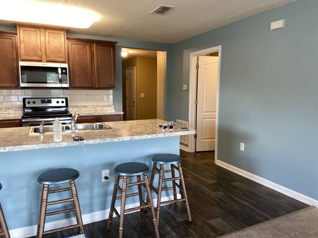
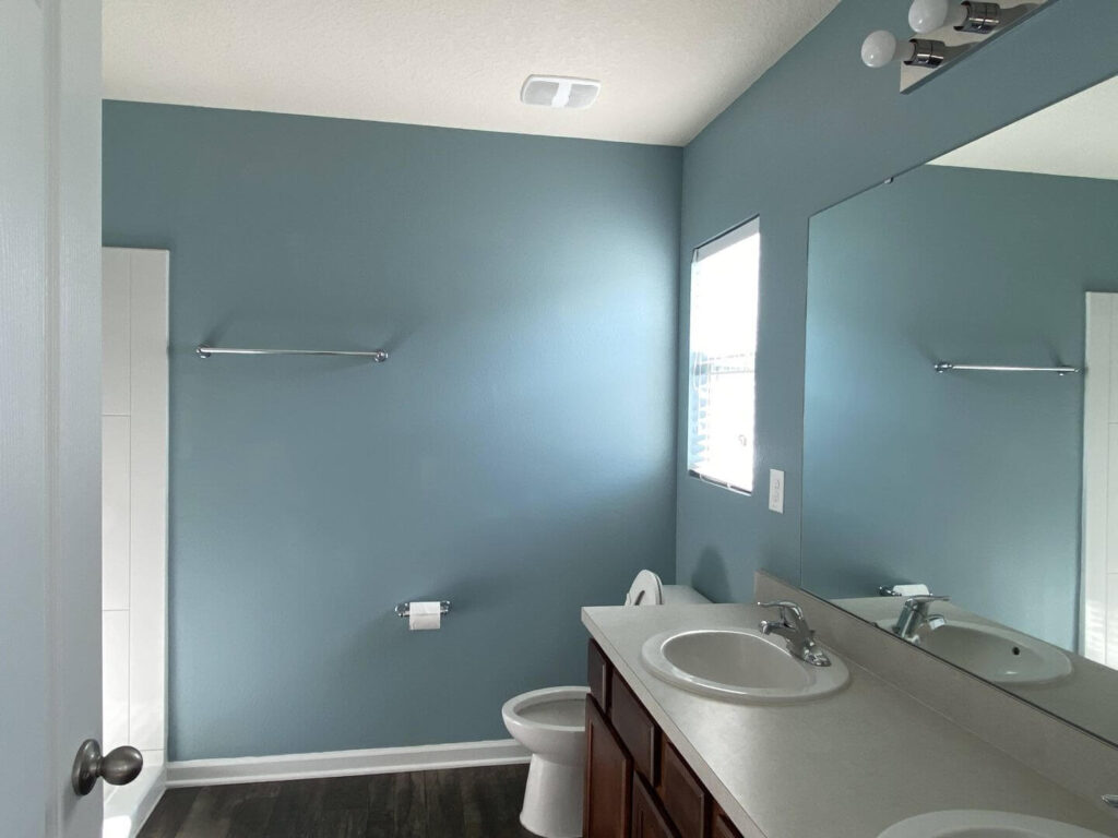
Blues
Blue is a very calming color, but it may also sometimes seem cool or distant. Blues on larger wall surfaces may produce a cold or sad mood in the house. We recommend picking warmer blues with more grey or yellow tones. Incorporating other colors with blue, such as brown, may also help create a harmonious ambiance in your home.
Let us deviate from color https://en.wikipedia.org/wiki/Colortheory a bit and look at the effect of colors on our everyday lives!
Which Color Is Going to Make You Happier? A Bit of Sunshine with Orange
If you use orange in a room, the effect will be immediate. Warm, familiar, and vivid orange reminds us of sunny days, freshly picked juicy oranges, and beautiful Floridian sunsets. Paint your walls orange, and you will feel more comfortable at home. Orange is the perfect choice for north facing rooms, which have less natural light and would otherwise have a shaded or cold look.
For a bold, but sophisticated look, combine light orange tones (pumpkin, tangerine, or carrot orange) with cool neutral colors. Light and soft hues (nectarine yellow, coral red, or peach yellow) are better suited for naturally well-lit large spaces, such as a living room or kid’s room. What better color reflects sunshine year around than orange?
Use Mature Colors and Create an Inviting Ambiance
We live in a world of contradictions, where everybody seeks the reliability of science and mathematics. We speak different languages, but numbers have universal meaning. This creates unity, no matter where we may be in the world.
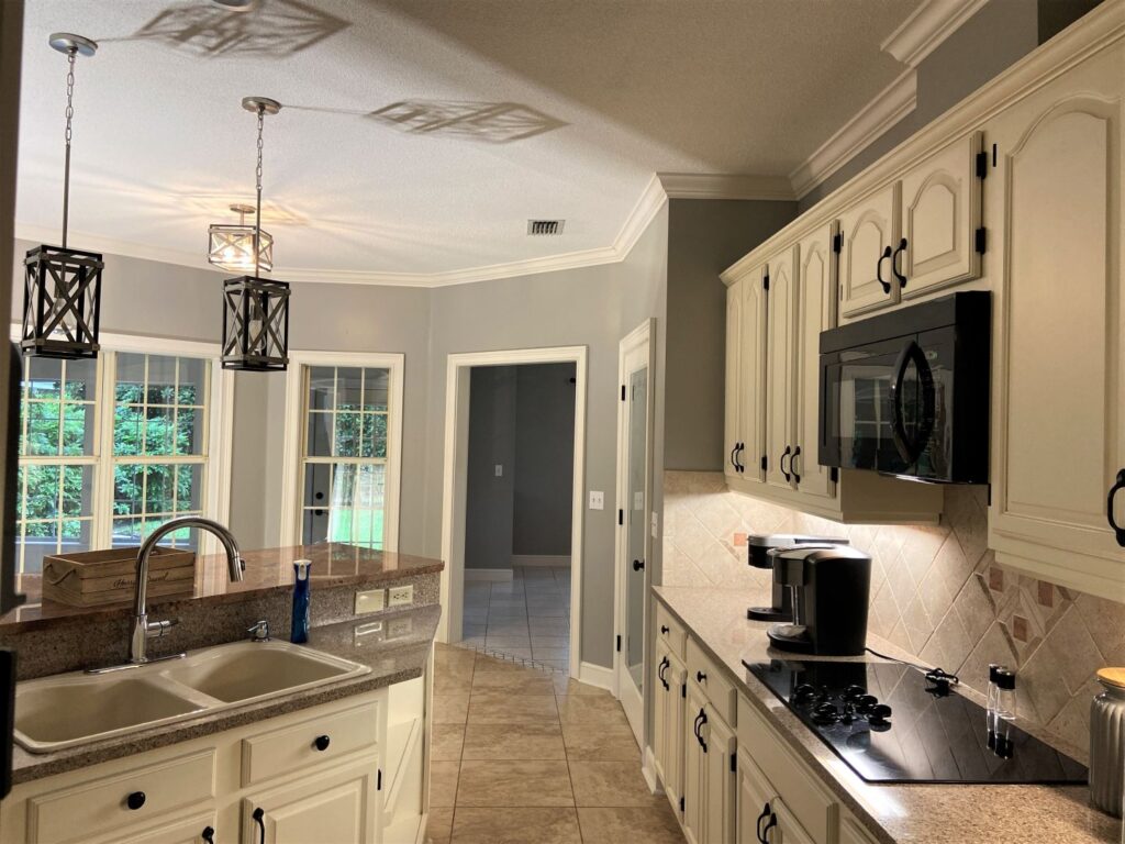
There is a science behind colors, and mature colors stimulate us to think analytically and incentivize us to set goals for ourselves to make our lives better. Mature, neutral colors such as light beige, eggshell, or brick red, go well with more full-bodied and dominant colors such as emerald greed, vivid turquoise, scarlet, or ochre yellow.
Neutral, mature colors and complementary interior decor elements made from natural materials such as darker wood, marble, or oak, provide the perfect combination.
Set a Romantic Tone with Smoky Colors
Choose pastel colors and create a calm and inviting home.
Muted, smoky colors are not only romantic but also mysterious. Pastel color gradients used with materials that create a contrasting effect such as lace or milk glass create a soft and airy appearance for your home.
The perfect color effect with pastels is achieved through the combination of soft and smoky colors, such as ripe plum, lilac, or pigeon gray. You could use multiple shades of these soft colors and create a more peaceful effect or combine them with rose red or lavender blue to create a floral atmosphere. In addition to the wall color, pick complementary natural interior decors to achieve the best results.
Layered Effect
The secret to a sophisticated and airy look is the careful layering of colors. We recommend using neutral cream colors in smaller spaces, which can be completed with just a hint of violet or lingonberry, to make the room look bigger. In larger spaces, darker shades are better, such as moss green or eggplant purple, so we create a defining focal point in our home.
What about white color? Read more: